
HK Electric · EY · UI/UX Design
Strategy blueprint and UI/UX design for HK Electric’s corporate mobile app
2021
“A 21-week engagement to redesign customer service platforms — strategy, recommendations, and a clickable wireframe prototype grounded in real customer behaviour.”
The Beginning
HK Electric engaged EY for a 21-week project to redesign its customer service platforms. Focus: strategy design and UI/UX for the corporate mobile app and content management system — leveraging smart meter technologies to lift engagement and strengthen HKE’s corporate image.
How We Do?
We ran a user-centred design thinking approach: benchmark studies, user surveys, and in-depth interviews to understand customer behaviours. Insights fed a comprehensive report, actionable recommendations for app functionalities, and a clickable wireframe prototype for alignment and hand-off.
“Findings had to become screens people could tap — not only a strategy deck.”
What customers needed from the app
Research and benchmarking framed the jobs a utility app must nail:
Bill clarity & pay now
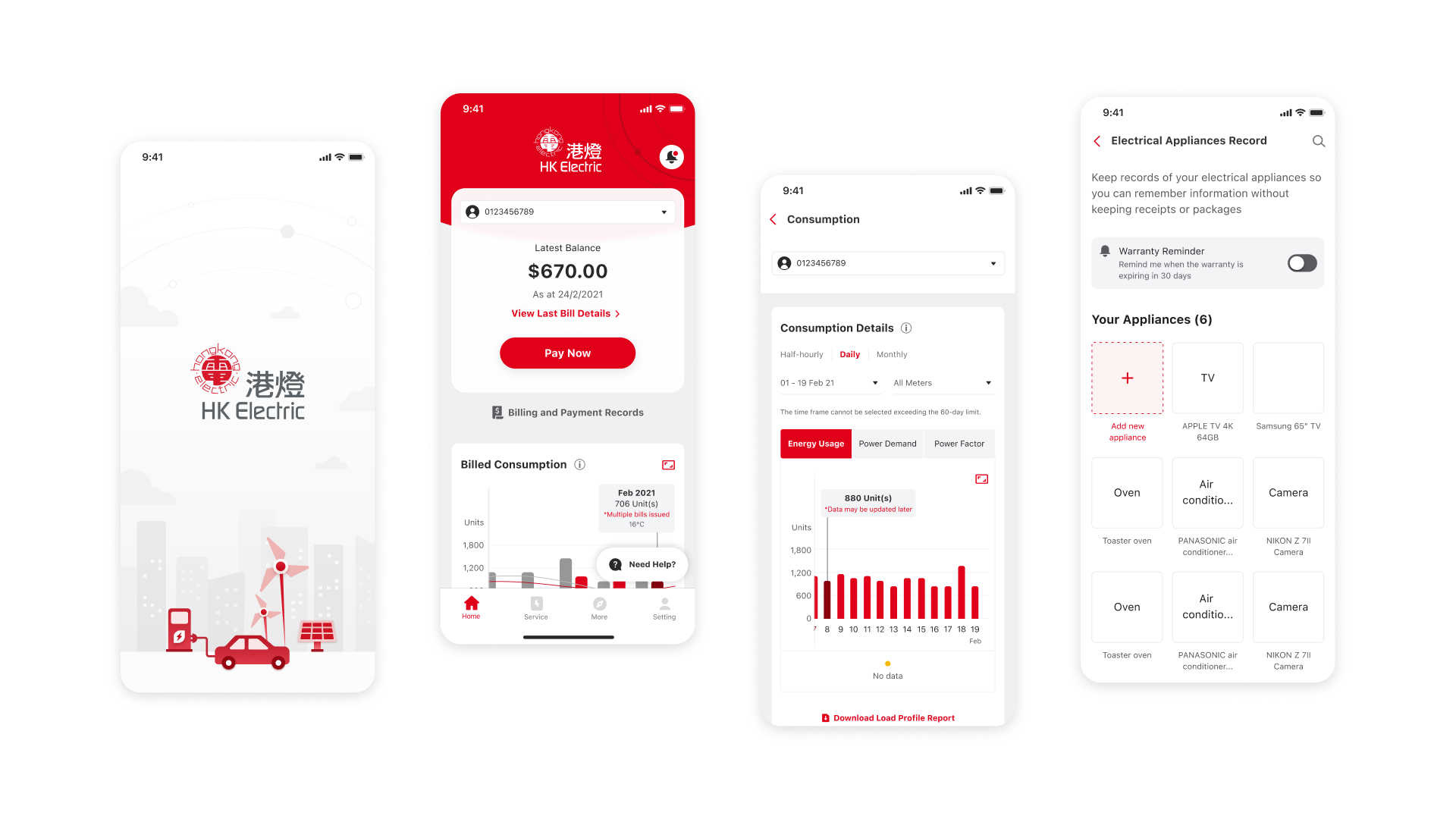
Latest balance, last bill details, and a primary Pay Now action had to be obvious on home — not buried in menus.
Usage you can read
Smart meter era customers expect half-hourly / daily / monthly views across energy usage, power demand, and power factor — plus exportable load profile reports.
Beyond the bill
Appliance records and warranty reminders extend the relationship past payment — turning the app into a home electricity companion.
From blueprint to tap-ready UI
The design system stayed true to HK Electric red / white while modernising hierarchy for mobile:
Home dashboard
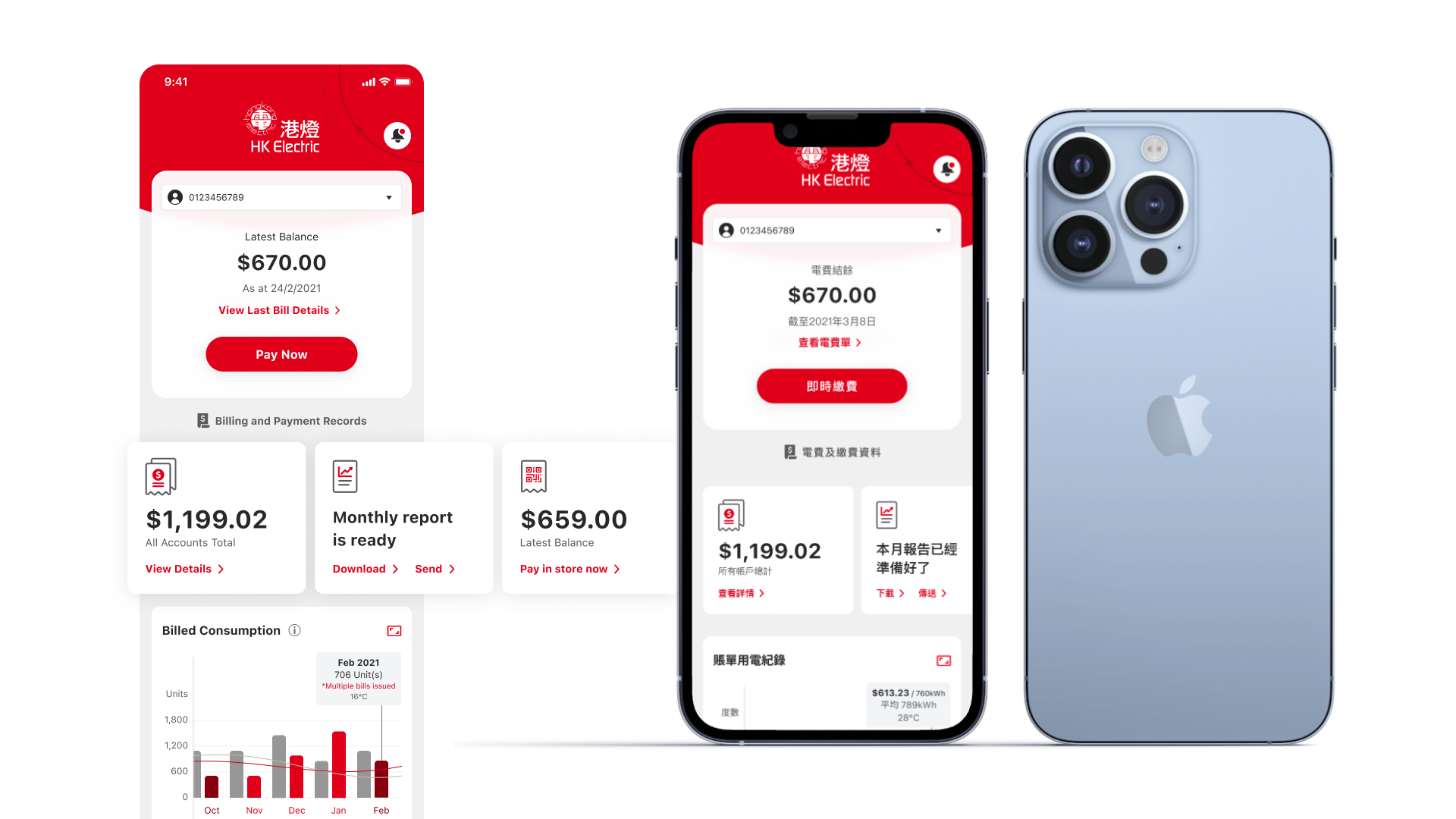
Account card, balance, Pay Now, billed consumption chart, and clear links into bill & payment information.
Consumption deep-dive
Timeframe toggles and metric tabs so commercial / engaged users can inspect usage and download reports.
Electrical appliances record
Digitise appliances and receipts, with warranty reminders inside 30 days of expiry.
Design principles
Principles that guided the corporate app redesign:
Hero overview
Strategy + implementation story on one frame: engagement context on the left, high-fidelity phone mockup on the right — Pay Now and account clarity as the first impression.
Core screen set
Splash, home with consumption bars, detailed energy charts, and appliance registry — the spine of the recommended experience.
- Design Thinking Research
- Benchmark & Surveys
- Strategy Blueprint
- UI/UX Design
- Clickable Wireframe Prototype
- CMS Considerations