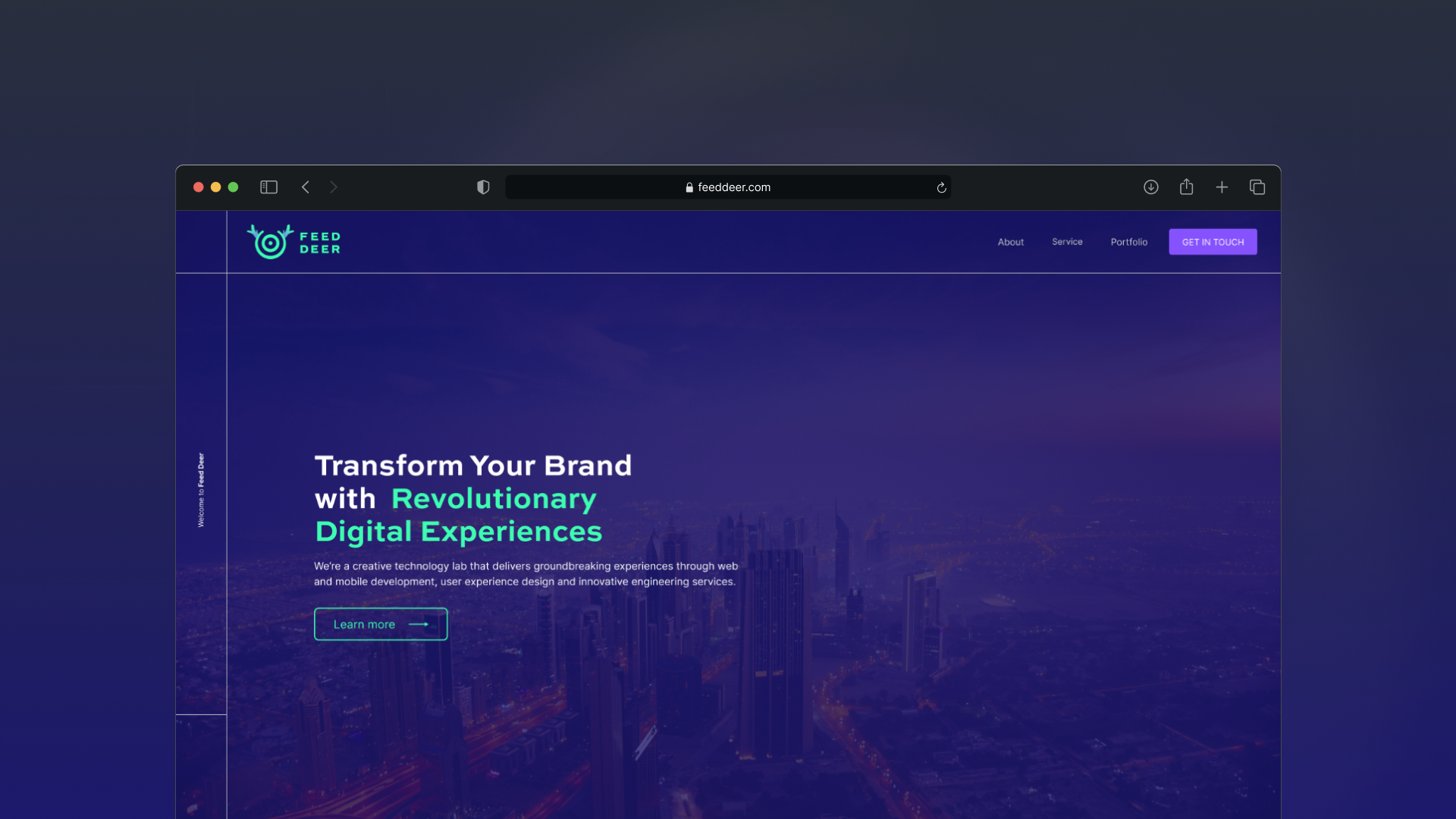
FeedDeer · Brand · Logo Design · Website
From brand mark to website — a creative technology lab that needed to look sharp enough to ship digital experiences
2024
“We’re a creative technology lab that delivers groundbreaking experiences through web and mobile development, UX design, and bespoke programming.”
Background story
FeedDeer is a creative technology lab — web and mobile development, UX design, SEO, content, social, and bespoke engineering under one roof.
Their promise was clear: transform brands with revolutionary digital experiences. What they didn’t have yet was a brand that could carry that energy. Creative-tech studios often look interchangeable — soft gradients, stock laptop mockups, language that could belong to anyone.
FeedDeer needed a mark people remember at a glance, and a website that could stage services from strategy to launch without reading like a brochure of buzzwords.
This was a focused project: branding first, then the website that wears it.
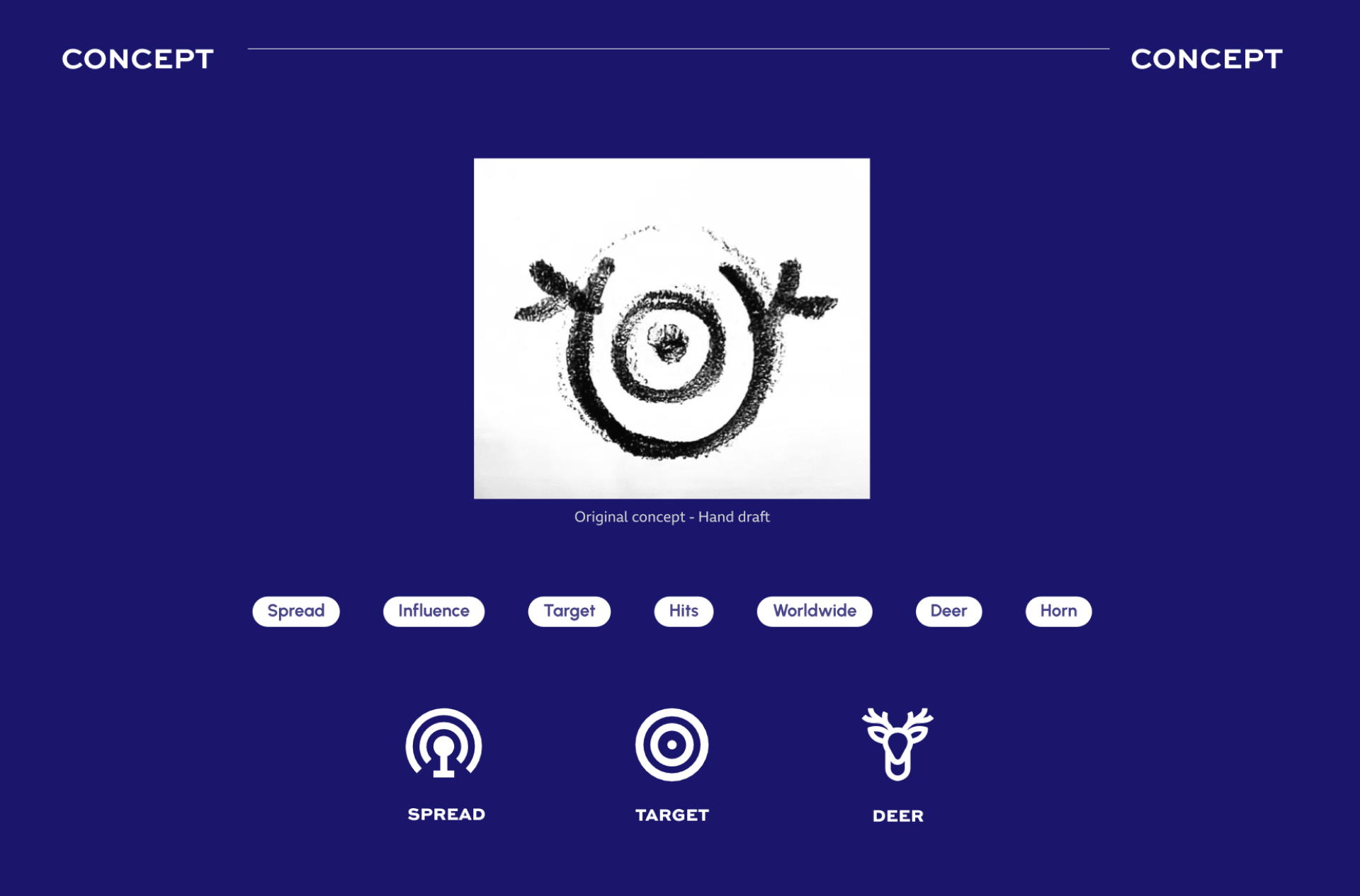
Logo and branding
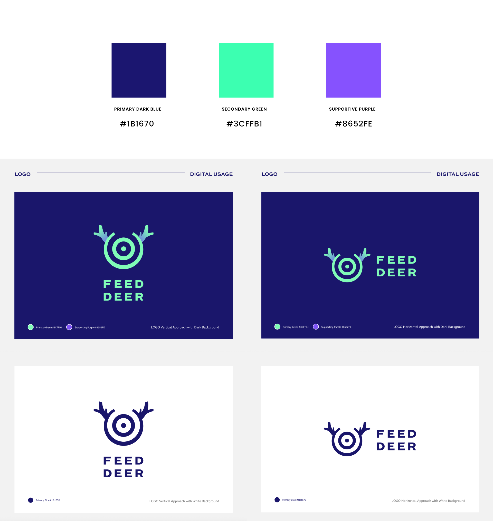
I designed the logo system and the colour rules that keep FeedDeer distinct from soft “friendly animal” agency marks.
The mark is a geometric deer: a circle that breaks into antlers at the top, with concentric rings inside that read as a target / bullseye. Antlers for the name; the centre point for focus — finding the right signal in the noise. Stacked FEED DEER caps sit under the icon in the same neon mint, so the lockup stays sharp small and loud large.
Colour stays short and high-contrast: primary dark blue #1B1670 for the night stage, secondary green #3CFFB1 for the charge, supportive purple #8652FE for CTAs and accents. Neon on night — premium and technical, not playful for its own sake.
“A circle that becomes antlers — and a target at the centre, so FeedDeer always looks like it’s locking onto the brief.”
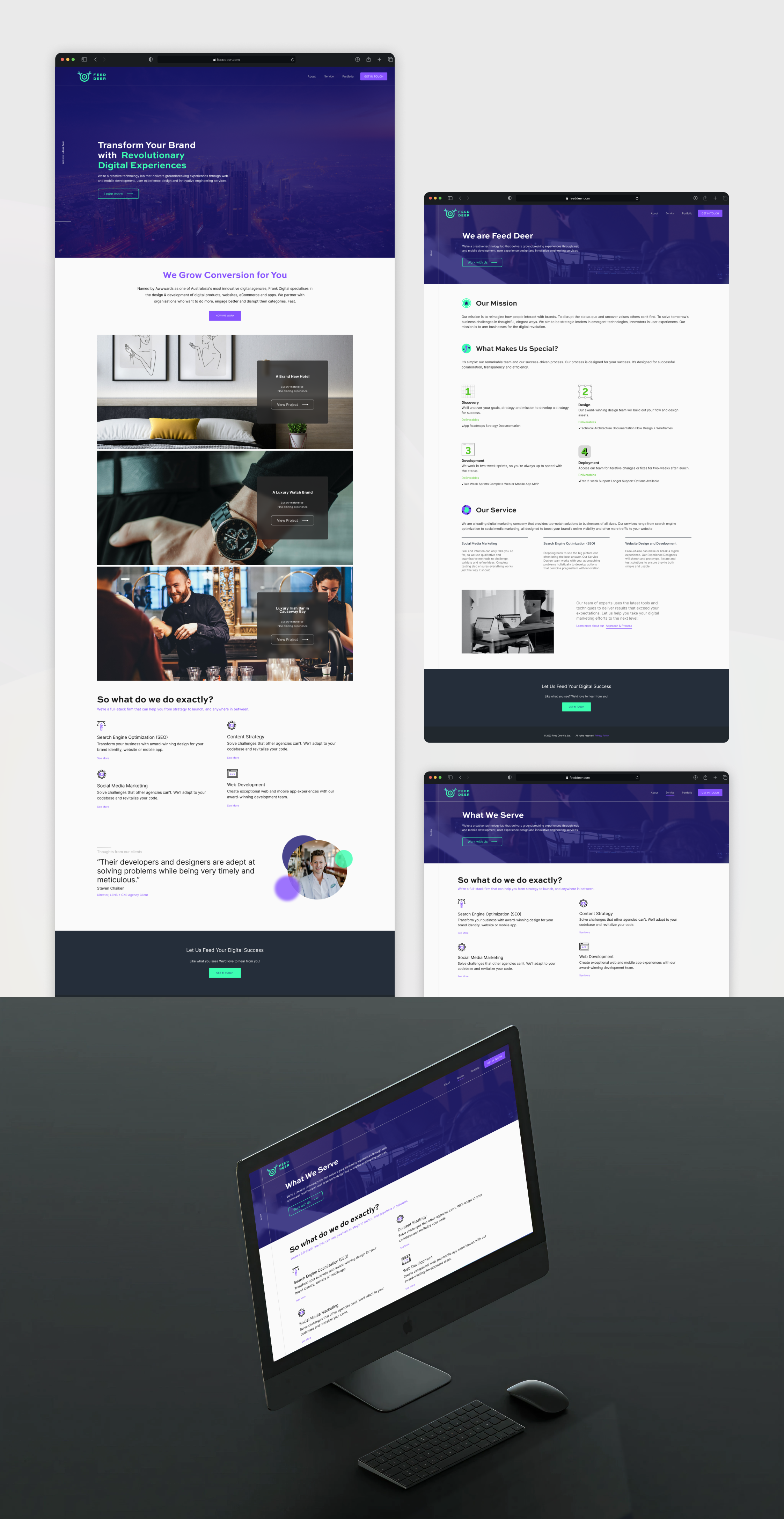
Website design
With the identity locked, I designed the FeedDeer site to wear the brand in public. Dark cinematic heroes carry the neon mark and the core promise; white sections open into a clear services grid — SEO, content strategy, social, web development — plus portfolio proof, process (discovery → design → development → deployment), and a closing CTA: Let Us Feed Your Digital Success. Same neon-on-night system from Behance frames to the live page mockups.
- Logo Design
- Brand Colour System
- Website Design
- Brand Presentation