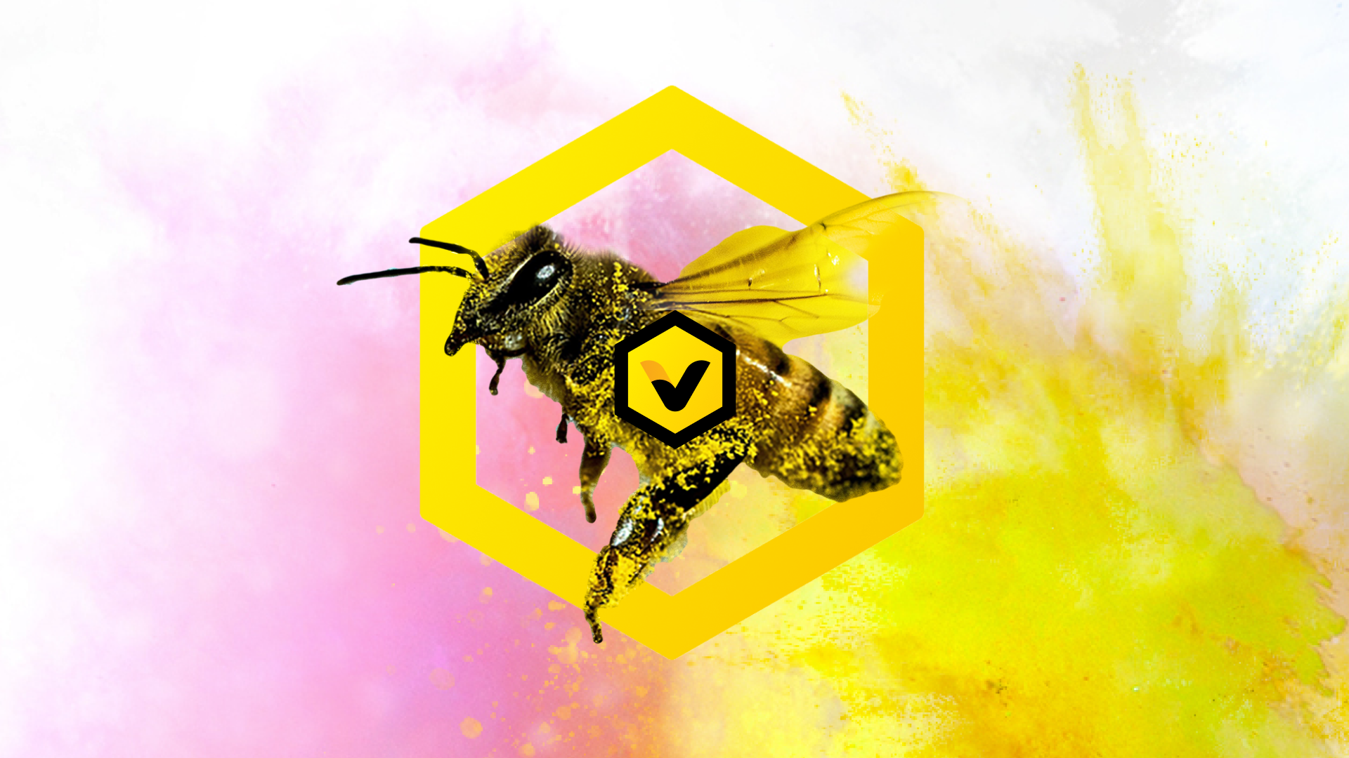
Beehire Personnel Limited · Brand · Visual Identity · Website
From brand mark to website — a small recruitment consultancy that needed to look like “the NOW style of hiring”
2022
“Help employers find the right bees for the hive — and help people find the best place to enjoy the honey they collect.”
Background story
Beehire Personnel Limited is a Hong Kong recruitment consultancy — permanent hires, temporary roles, HR outsourcing, and psychology-based corporate support (EA Licence No. 57975).
Their idea of hiring was simple and human: cooperation. Help employers find the best-matched people to build a team; help candidates find the right place to grow. In their own words — look for the best bee to build the hive, and give that bee the best place to enjoy the honey.
What they didn’t have yet was a brand that could carry that story. Recruitment sites often look interchangeable: navy, stock handshakes, stiff language. Beehire needed something energetic and modern — a full identity and a website that could speak to both sides of the market: people looking for jobs, and companies looking for staff.
This was a focused project: branding first, then the website that wears it.
Logo and branding
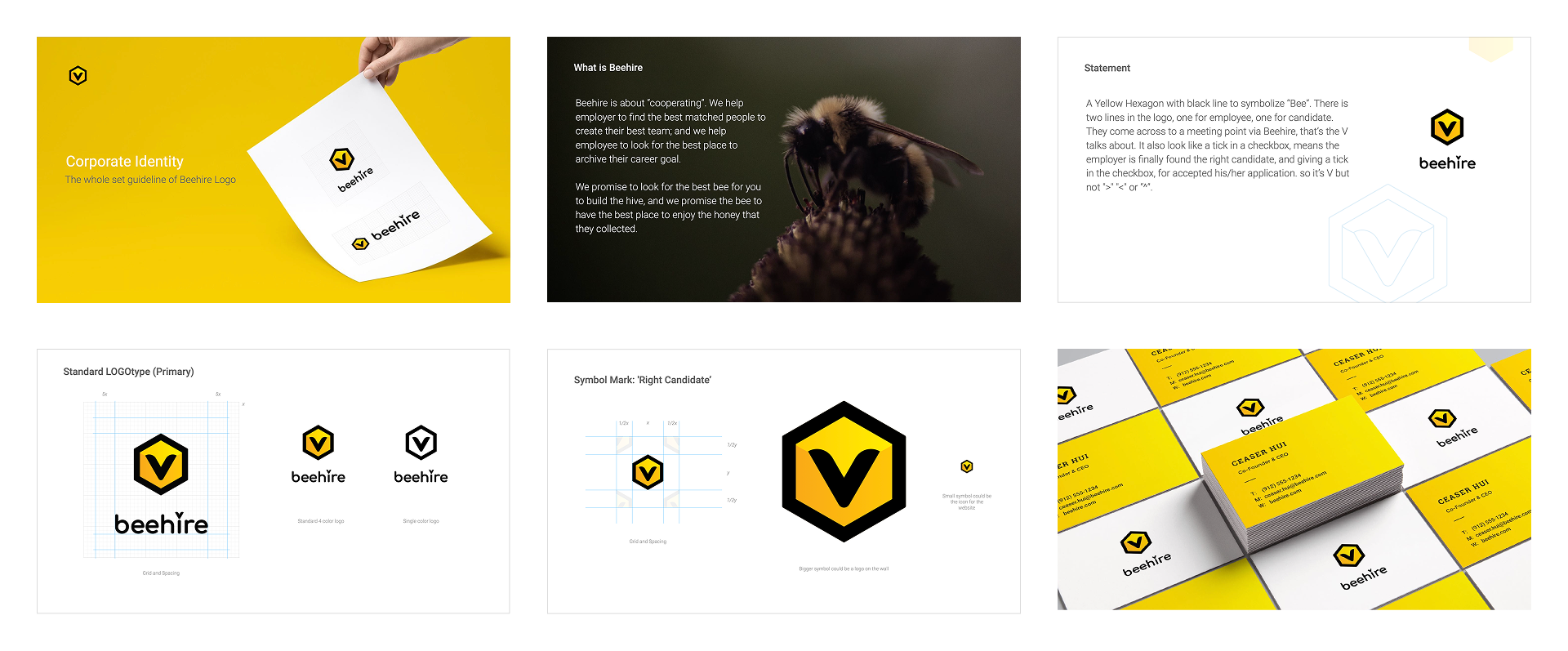
I designed the full corporate identity — logo system, spacing rules, colour, and how the mark behaves on light and dark backgrounds — documented in the Beehire CI guideline.
The mark is a yellow hexagon with a black outline: the geometry of a hive, the colour of a bee. Inside it, two lines meet at a V. One line stands for employer, one for candidate — they cross at Beehire, the meeting point. The V also reads as a tick in a checkbox: the moment the right person is found and the hire is confirmed. That’s why it’s a V, not a chevron or a caret.
The system includes a primary logotype, a horizontal lockup, single-colour versions, and a standalone symbol for walls and web icons. Clear space is set on a simple x-grid so the bee never feels cramped.
Colour stays bold and short: black (#000000) plus a yellow range from brighter #fff100 to deeper #f9a51a / #ffca05 — loud enough to own a recruitment category that usually plays it safe.
“A yellow hexagon with a black line to symbolize “Bee” — and a V where employer and candidate meet.”

Website design
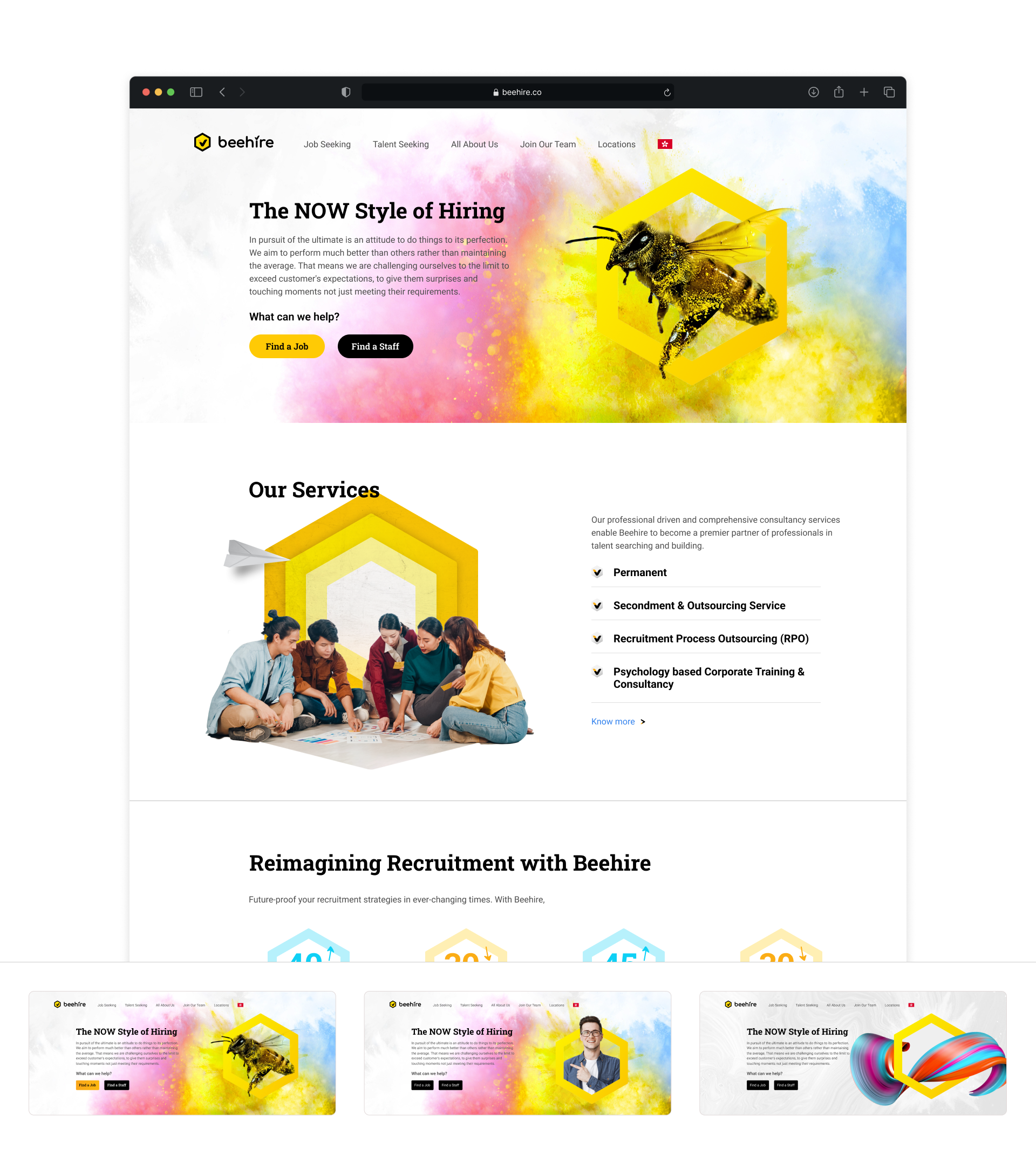
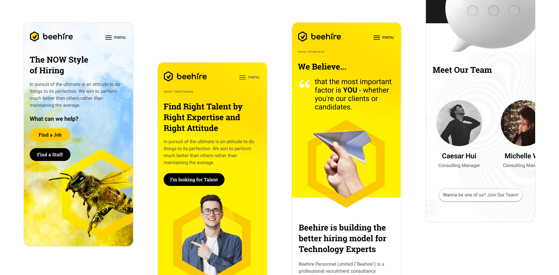
With the identity locked, I designed beehire.co to wear the brand in public. The site splits the market cleanly — Find a Job for candidates, Find a Staff for employers — while keeping one yellow-and-black system across landing, talent seeking, about, join-our-team, and location. Hex frames carry proof points; colour-burst photography keeps the “hive” energy; mobile keeps the bee mark and CTAs thumb-friendly. Same brand in the browser as on the CI page.
- Logo Design
- Corporate Identity Guide
- Website Design
- Brand System Application
See the real product in the wild.
beehire.co↗